Kissena Forum Archive

Sandbox - Trash Talk, Tall Tales & Flotsam... It's a mess in here!

2843 comments · 30803 views
don't ever see WDC naked then...
We open to all, and it is not that I left and came back to the same jersey. Its that I do not have to spend $250+ a year on clothing to match my teammates.

I understand that people want to contribute and add to the whole, but this balance would have to stretch a long way. Sponsor changes have altered the look of the kit, but not the feel. That is to say the variations from year to year are slight and there is intention and effort to keep that. It is very easy to fall into a cliche, just remember the discussions which went on this summer of members who read the forum and those which do not. The "DNA" which we are always patting ourselves on the back for is that we are a team in club clothing.

We do not have sub teams, that has upset people in the past. But when we did it brought us to the brink and the club was on the verge of closing it's doors. Rather then let racing, and indeed serious cycling, in NYC fall in the privy of the elitist cultures we changed our constitution, opened the doors to all and began protected the races which were disappearing because of lost support. Imagine racing in NYC without the FBF or the PP races we took over and turned into a summer long series or the twilight series, memorial and labor day at the track.
guys guys guys!

everybody relax!

we aint changing the racing kit - we're just talking about doing some fun stuff with an OPTIONAL, NON-RACING jersey.

this will either be a wool thing we wear during our Gentlemen's Races, or a collectible that erroneously identifies our sponsors to be White Castle and Dr. Jay's Sporting Goods.

kissena rules, and everything ragot and clayton said is true.

this little clothing project will not change any of that or draw attention away from those beautiful truths.
anyone want to get monkey balls sublimated on next year's bibs?
I personally would see a change/evolution/update/amendment of jerseys as an excellent idea. I don't quite understand why changing jersey means that people (from the past?) may feel excluded. Let's be honest here. A jersey/short combo costs less that $100. I know that's not cheap but this sport is not cheap. I'm going to pay $30 to ride around the park tomorrow morning. I spend more on bike parts than I do on living costs and just spent a cumulative total of $600 entering, getting equipment for and taking part in the Tour of Catskils. I'm not overly convinced that money is a good reason NOT to alter our jersey.
I agree. Lots of big "clubs" (NCVC) change their jerseys (we change our sponsors too) every few years. It's not a horrid, overpriced burden. It keeps thIngs fresh and moving forward. Change is good, and while I like the contrasting color scheme and it's relation to NY, a new design might actually look better and even appeal to a few new riders.

We have a lot of great designers on the team, and I have a lifetime of experience in the arts. I would be willing to assist in any new bib/jersey layout. Again, ours isn't bad, but hasn't it been the same for a long time? And as was pointed out, its changed since the 80's and 90's. Why is now not the time for an update when so many are interested? It's just a thought.
I have to admit, I'm pants down on this one... I had no idea that Kissena colors were related to a flag, or that, cringe, an NYC flag even existed.

Mostly flown without the crest, symbolism:
Bald Eagle: The symbol of the United States of America.
Native American: The original inhabitants of the area.
Seaman: Symbolizes the colonisers of the area.
Beaver: Symbolizes the Dutch West India Company, which was the first company in New York (called Nieuw Amsterdam back then).
Windmill: Remembers the Dutch history of the city and the prosperous industry of milling flour.
Flour barrels: The industry.
1625: The year in which the city of New Amsterdam was founded by the Dutch.

Dammit, now I have to redesign the NYC flag as well. I'm thinking fall fashion colors...

No seriously, Eric, thanks for the lowdown, it's great to hear about the history of the club and it's reason for being. I think the best design comes from a great idea and I think the way you describe the club Eric is really important for us to all remember: the bedrock, supporting NYC racing, few barriers of entry, egalitarian (pioneer even). The thing I see is an opportunity, is to make the DNA of Kissena more apparent. If this is what we stand for, then everything we do, every point of interaction should hit on these truths in some way (not necessarily a literal way). I'd like to pull up a stool next week and drink beer... er I mean, talk about this some more. Did you know that Kissena is Chippewa for "it is cold" or "cool water" (referring to the lake in Queens). How about Occonors on 5th ave midweek? Or that bike friendly place on Atlantic, what's her names? Perhaps our L&C slush fund can foot the bill.

>>>>>>
Identifying the Core Idea
If every brand is built on a core idea, how do companies identify the right one?
Market research provides crucial information for identifying a brand’s core idea, and how it should be expressed for maximum effectiveness. A comprehensive brand research program analyzes a brand’s situation by understanding the brand’s history, its trajectory for the future (i.e., the leaders’ vision for the brand), its core competencies and potential weaknesses. It also scopes out the playing field by comparing the brand with its principal competitors, placing it in context within its category and possibly finding gaps in the competitor offerings. Finally, research can uncover which attributes are most valued or desired by customers. The brand’s core idea is pinpointed by carefully analyzing this information, ensuring that it is rooted in truth, differentiated from competition and relevant to customers and prospects.
The core idea of the brand should impact both internal and external “touchpoints,” or points at which the brand interacts with customers, employees or other relevant individuals. A brand’s touchpoints vary by situation and strategy. Because brands are ultimately judged by their actions as much as their messaging, thinking about touchpoints in these categories can help determine an action plan for the brand that is consistent with the core idea.
Here it is:
I say keep the jersey, but maybe redesign the booties/ gloves/ socks/ cap? Make them all match but stand out form the kit.
Another great thing about the club is the name. We're not advertising furniture, cycling products, an ego, or whathaveyou. It's an Indian word (that I've read) means "it is cold". That's fucking cool.

Bc it is half the year.
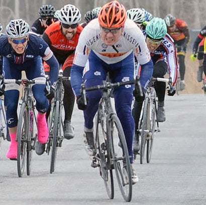
Got inspired by this thread and while I'm a huge fan of Kissena, I'm not in love with our current kit design. The image of Al in a vintage Kissena Cycling Club jersey struck a chord. I thought I'd throw this sketchy, simplistic design to the forum for comments / thoughts.
My two cents regarding jersey redesign:

I feel like I do when watching/listening to the judges on Project Runway critique contestant's clothing designs. "Really, you think that was one of the worst designs?" I often find myself totally disagreeing with them.

1. I love our connection to the NYC flag.
2. I look good in navy blue
3. Too much orange makes me think of one of the 150 Champion system "sub teams" out there
4. Radical redesigns are hard on the budget. My BFFs at We Stand United have jersey redesign ADD.
4.5 On the other hand, can someone please redesign CCBs kit?
5. I'm too old and or grumpy to get enthusiastic about "Retro" designs. Fashion forward please.
6. Sublimated ass panels become peek-a-boo panels too easily.
Posted By: Jeff OwensAnother great thing about the club is the name. We're not advertising furniture, cycling products, an ego, or whathaveyou. It's an Indian word (that I've read) means "it is cold". That's fucking cool.

Bc it is half the year.
agree 100%. it's nice representing a region rather than a business or sponsor... sort of like how so many railroads used to carry the names of the cities/towns/regions they ran through rather than having some impersonal conglomerate slogan. it has more character and conjures the imagination...

The only other jerseees i like the NYC area are BH and Mengonitis. i think Kissena is nicer than both. My only change would be to have the Kissena bibs with Rapha chamois (welcome to fantasy land)

While I like orange, Jef K, that looks a lot like the Rabobank jerseys.

if we were going for a re-design i would opt for something more on the minimal side since we don't have to plaster sponsors all over everything.
I think there are four distinct themes here and it's important to address each:

1 it would be cool to have retro WOOL jerseys
2 our club DNA shal not be trampled or degraded
2.5 that means (among other) things no sub teams
3 our Jerseys have evolved in the past and lots of people like talking about the next generation - be that subtle or bold. I think we'd all be surprised if Kissena 2021 kit looked *exactly* like 2011 kit
3.5 we all like beer
4 everyone involved in the discussion is speaking up because they want to help make the team even more awesomer

So 3 cheers for more awesomer, more beer, and more talk
For those who don't know...

CCB, short for Cycle Club Basingstoke, hails from both the North Shore of Boston and I believe the UK. They have not changed their jersey design since nearly forever. You can also know them as the incubator for Tyler Hamilton, Tim Johnson, Will Dugan, and the baddest-ass New England squad on the planet. If you saw pics of Hamilton from the early 90s or Johnson winning his first CX nationals in 1995, you'd know it instantly.

Our newer Champion-System shorts are double-layered on the ass panel.

Jules,

If I could get the NYC flag on a name sticker, it would be worth considering.

All,

If you want to get all NYC booster, check out "The Island at the Center of the Earth" by Russell Shorto. Even though probably none of us have ancestors who were here back in the days of Nieuw Amsterdam, Shorto makes a great case that the city, and not the settlement at Jamestown and not the Massachusetts Bay Colony, were where "America" was born.

Here's Tim in 1999
http://autobus.cyclingnews.com/photos/1999/dec/TimJohnson3a.jpg
As long as we keep to orange and blue I wouldn't object to a kit re-design. I like the old-school mockup from Jef, that elicited a "ooooo I like that" from her-indoors.

Agree - it would be cool to have wool winter tops, or even track jackets.

Most importantly ... when are these beers happening ?
Done
I put in my results, but they are not showing up unless you sort by column.
It seems that a happy medium jersey update might be achieved by giving a designer the requirement: design a new kit that looks just like the current kit from a distance, but --on closer view-- something new and nice.

The designer would: 1) Keep the essential pattern of a white jersey wrapped with orange and blue "V" shaping and centered "Kissena" front/back, 2) Add some character to that pattern in the way that designers do such things --for example adding some texture and/or line-qualities and/or flurishes and/or simplifications, and 3) perhaps, bring-on a new typeface that doesn't look like a public bathroom font.

On the latter two points, I think it would be nice to take the design toward something consistent with the esthetic of many small Brooklyn companies based on "craft". But there are other appropriate stylings and I defer to the graphically gifted to provide guidance. Designers know how to meet such requirements, to create something excellent, keeping the past in-tact, and freshening it.

Cheers,
Norm

p.s. hopefully, the designer(s) would throw in a nice bonus by dropping the orange stripe on the bibs --it doesn't flow with the jersey pattern, although it does look retro in a 1970's Bruce Jenner track short way.

p.s.s. I'm fine with keeping the kit as-is --a nice bonus is that Fred's don't join Kissena just to have a cool kit. So our current sublimation is working subliminally to keep us cool.
And a question for the club veterans and historians: if our colors are based on New York's Amsterdam origins, why is our blue not a proper niew blue? Things blue in the Netherlands are rather brighter, are they not?
Just happened that way.
Its NYC Colors we're based on, not Dutch
The bibs are my favorite part of our kit! I really like the orange transitioning to the blue outline, transitioning to the white "KISSENA" letters. I just think that particular color transition works really well. I don't disagree that the bibs may not integrate perfectly with the jersey, though.

Our blue is pretty close to the New York Flag: http://nydn.us/qcSKCk

Our orange does seem a bit more "vivid," however (at least for the first couple dozen runs through the washing machine).
Ah, that was my guess. Thanks for the reply.
@Jeff --I'd have to see the flag in-person, as photos and computer displays aren't very trustworthy for true color.

All said, I like the Kissena blue we have just fine, maybe more than the brighter blue of the Dutch flag / New York flag. As for NYC vs. Netherlander colors, I understand that they are identical (that's why I was referring to NYC and the Netherlands color interchangeably above). But, maybe New York modified them.
So you should all take a look at the Kissena Happy Hour thread. Maybe we could take this discussion from the online world to the in person world, and discuss jerseys, NYC history, aesthetics and technology of lycra sublimation, the usage of dry hopping as a technique for increasing the floral notes of IPAs, and if folks are interested, the upcoming cyclo-cross season.
Apologies if I kneaded this thread toward new threads too much!

Beer sounds good.
+1
Subduing the orange: agreed

Not too much orange though in the overall design though, sorry! More overall white would be good. I like the Mengoni and Finkraft use of white.

New main font: agreed

Better transition from jersey to bibs: agreed

Add a more interesting panel layout to the bibs as well.
I'm fine with the old jersey/bib, I'm fine with whatever our designers/board members will decide.

I'm not trying to hijack this thread, just to complain once more about one thing which is important for my butt:

JP wrote "Our newer Champion-System shorts are double-layered on the ass panel". Maybe so, but after the Tour of the Catskills my a$$ was asking me all day long during three days why the chamois hurt like this! (I'm talking about the new summer version with "improved" chamois). It did a good job at Tokeneke (44 miles only, with rain) though. I heard through the grapevine that I'm not the only one to experience that. Apparently, it's due to the varying thickness... I use DZ nuts, Assos, Chamois Butt'r...
This never happens with some of my other bibs, so I know it's due to the chamois. Except for short races, I have to race in those other bibs.
I have four different bibs with which I have no problem during long/hot rides : campagnolo, descente, power wear or something like it, 2010 Saxo Bank (cannot race with those because the team appears in big letters, too bad, they're thin and wonderful). After ToC, my butt was like a newborn having worn wet diapers for long hours!
Norm told me it's the difference in thickness that cuts like a seam.
The previous ones were worse, the lycra does not hold anything, while racing I have to put my balls back to where they belong, etc. I just wear these for really short rides.
BTW, congrats on your resilience at Tokeneke!
There are pictures posted at http://www.printroom.com/ViewGalleryPhoto.asp?shopperid=VL541M694VGK9MRDQJFSHS77F8QD8C87&userid=paiwacket&gallery_id=2715539&image_id=116&pos=1

picture 4, I'm hidden, but I'm the third in the break (stupid of me) after the start, lasted till we got to the climb...
picture 6 Ryan and Norm.